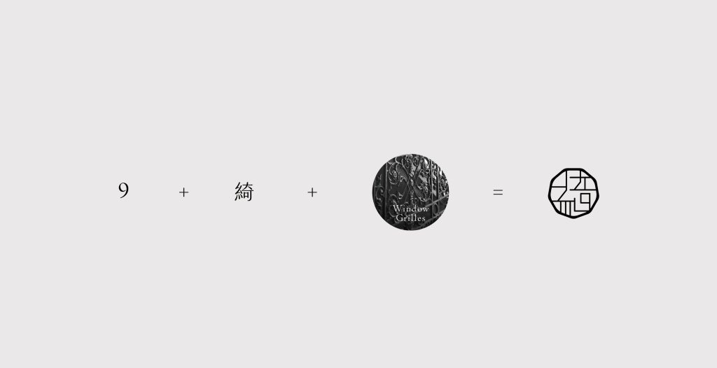
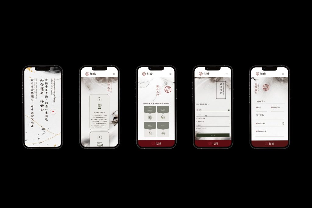
This design incorporates the brand name “綺” and the number “9” to create a distinctive visual identity,
seamlessly integrating elements of traditional Chinese window patterns to highlight the elegance of Eastern aesthetics.
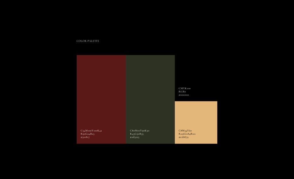
The color scheme features a deep red tone as the primary hue,
emphasizing the brand’s Chinese-inspired sophistication and professionalism while conveying a refined cultural essence.
このデザインは、ブランド名「綺」と数字「9」を組み合わせた独自の視覚的アイデンティティを構築し、
伝統的な中華風の窓枠模様を取り入れることで、東洋美の繊細な趣を表現しています。
色調には深い赤を基調とし、ブランドの中華風の洗練された質感とプロフェッショナリズムを際立たせるとともに、上品で文化的な雰囲気を伝えています。