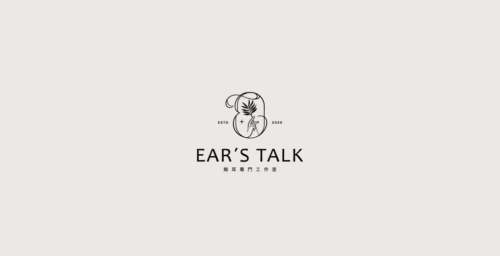
此款商標設計以字母「E」為耳窩的設計意象,構思上採用手持掏耳棒形象,直觀地展現了品牌服務項目及專業性。
This trademark design uses the letter “E” as the visual representation of an ear canal, incorporating the image of a handheld ear-pick tool. This concept intuitively showcases the brand’s services and professionalism.
この商標デザインは、アルファベットの「E」を耳の穴のデザインイメージとして取り入れ、手持ちの耳かきの形をコンセプトにしています。直感的にブランドのサービス内容と専門性を表現しています。